Leveling the field for aging.
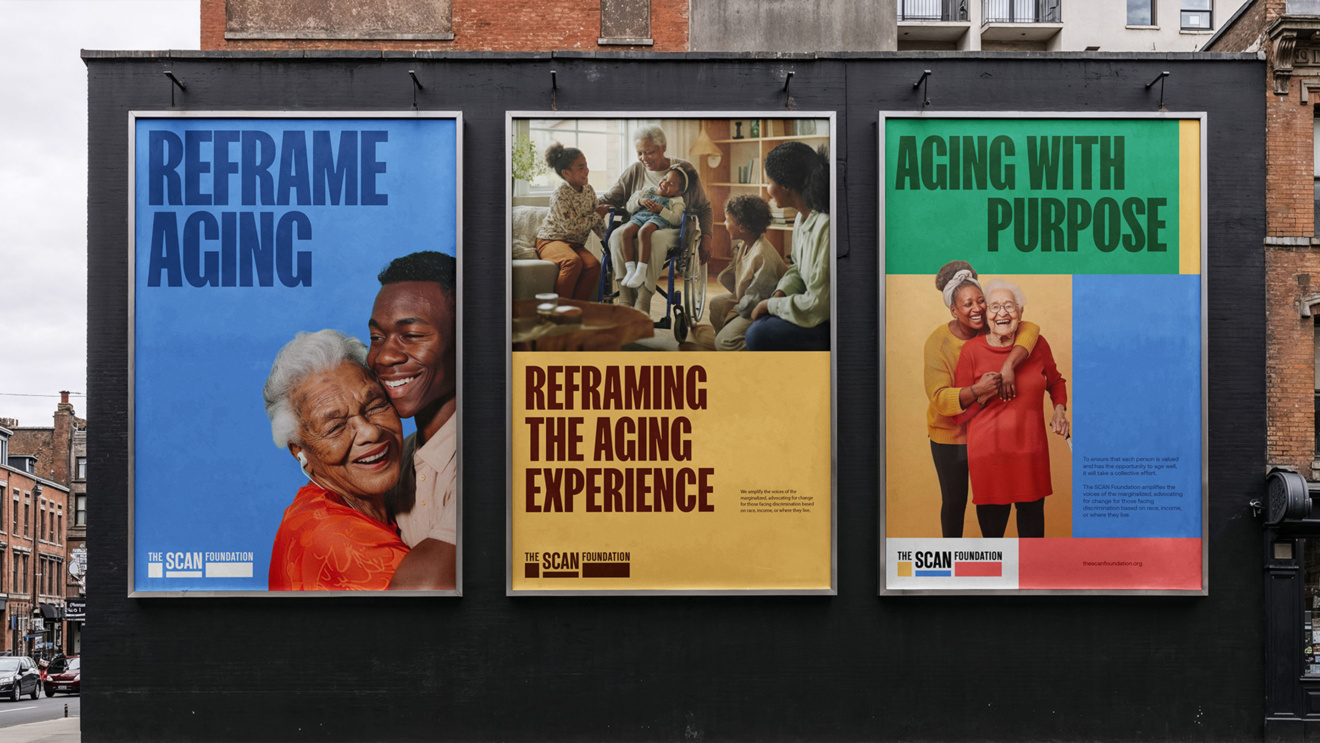
The SCAN Foundation’s (TSF) mission to ignite bold and equitable changes in how older adults age — both at home and in their communities — required a brand identity that reflected its leadership in driving systemic change and its commitment to challenging assumptions about aging while upholding dignity and self-determination. Centered around the creative strategy of “Aging Reimagined” the refresh brought clarity, cohesion, and vibrancy to TSF’s visual and verbal expression by embracing a dynamic visual system, bold storytelling, and inclusive design that rejects stereotypes and clichés so often seen in brands representing older generations and speaks with older adults as equals, reframing the narrative on aging. By amplifying its values of equity, collaboration, and innovation to create better solutions for an aging population, TSF now has an identity that inspires trust, drives action, and strengthens its pioneering mission in creating a level playing field to transform care and support for our later years.
An identity that shows we care.
The challenge
The US population is aging at a record pace. By 2060, one in four Americans will be 65 years and older, the number of 85-plus will triple, and the country will add a half million centenarians[1]. But despite this growth, older adults are struggling, they face significant challenges in access to care, financial stability, and social support systems. These disparities disproportionately affect marginalized groups, including people of color, low-income individuals, and those living in underserved communities.
The SCAN Foundation recognized the urgent need to address these challenges by amplifying the voices of those most affected and advocating for meaningful change. Its previous identity lacked the boldness and cohesion needed to fully embody its mission of creating a world where everyone can age well, with dignity and purpose.
Guided by the creative strategy of ”Aging Reimagined,” the refreshed brand embraced forward-thinking lenses to transform perceptions of aging. It positioned TSF as a leader in reshaping systems of care and support, ensuring equity and inclusion are at the forefront of its work.
To achieve this, we developed a refreshed brand identity that aligned with TSF’s strategic vision. The new identity had to feel modern, vibrant, and impactful—while avoiding outdated tropes or overused design cues in the space.
The opportunity
At the heart of the refreshed identity was the concept of Equity, a principle central to TSF’s mission. The logo became a powerful symbol of this idea, with its three rectangular shapes representing diverse needs and circumstances coming together to create balance and opportunity. These vibrant blocks also symbolize the uniqueness of each individual’s life journey, reflecting TSF’s commitment to celebrating diversity and fostering collaboration.
We amplified the vibrant color palette, using hues like Coral Red, Sky Blue, Warm Yellow, and Earthy Green to convey energy, compassion, and optimism. These colors were paired with deep accent tones to ensure accessibility and legibility, meeting WCAG 2.2 accessibility standards. Careful attention was paid to avoid associations with other organizations in the space while maintaining a fresh and modern aesthetic.
Typography played a critical role in reinforcing TSF’s personality trait of confidence and transformation. FK Screamer, with its condensed and commanding structure, was chosen for hero and headline messages, reflecting the foundation’s authority and visionary ambition. Aeonik complemented it for body text, offering clarity and inclusivity across all platforms.
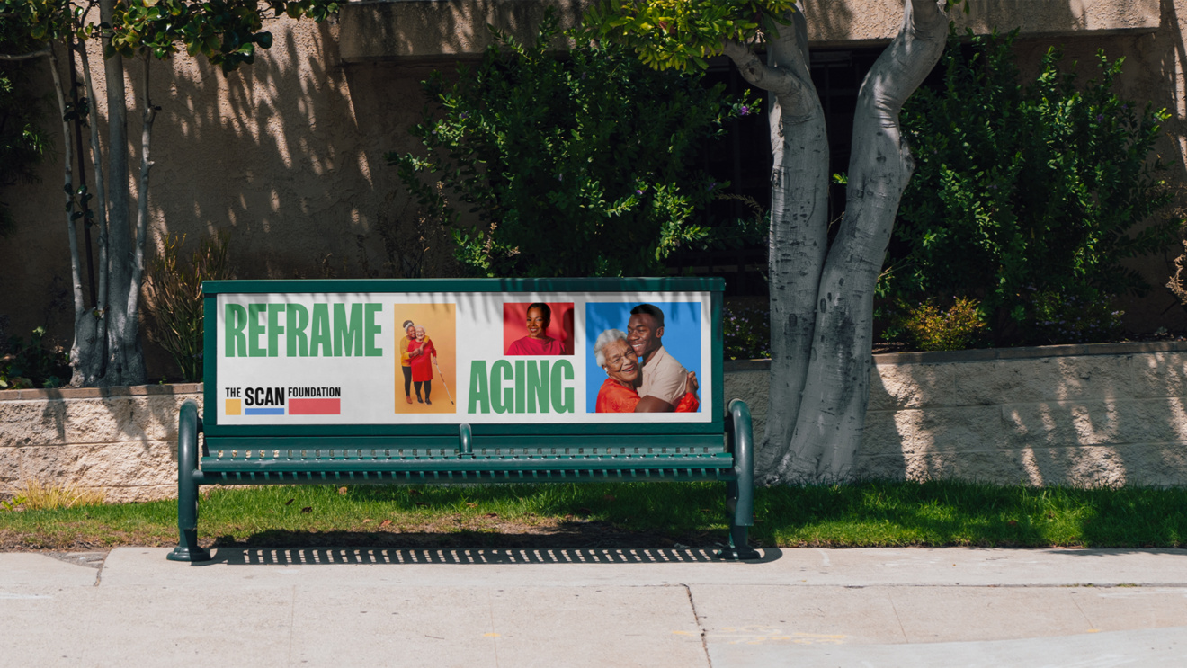
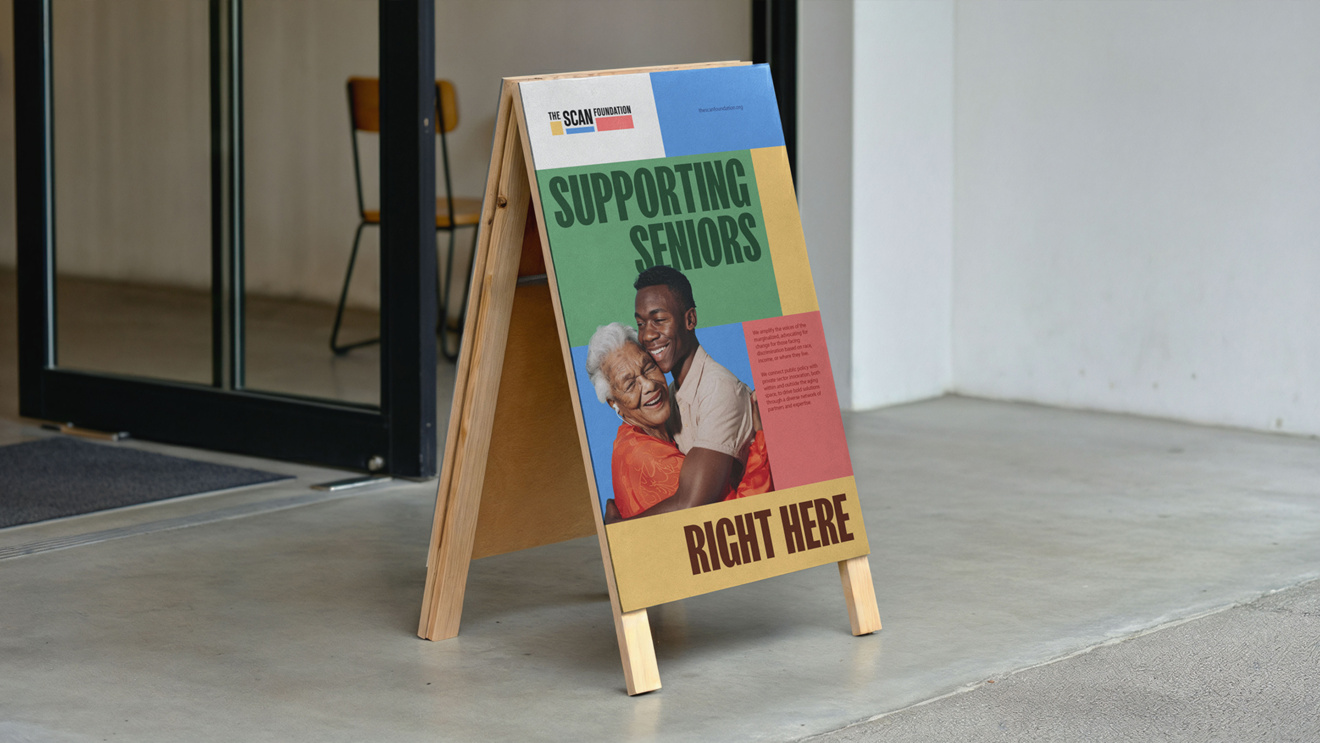
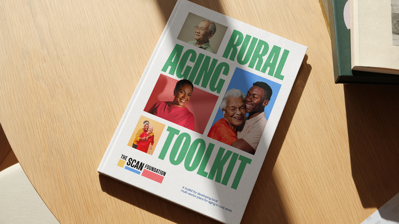
Photography guidelines emphasized authenticity and representation, capturing older adults’ lived experiences with dignity and vibrancy. Lifestyle and studio photography highlighted diversity across ethnicities, ages, and abilities, aligning with TSF’s commitment to inclusion.
The design system introduced a flexible grid structure and modular blocks, allowing dynamic layouts while maintaining consistency. This approach ensured adaptability across digital and print formats, from annual reports to social media campaigns.
Data visualization balanced functional clarity with expressive creativity. Whether in presentations or infographics, data was designed to be impactful, accessible, and aligned with TSF’s narrative of equity and transformation.
The result
The refreshed identity for The SCAN Foundation is distinctive, inclusive, and deeply rooted in its mission to reframe aging. It provides a cohesive and flexible system that empowers TSF to communicate effectively across all platforms while building equity into its distinctive brand new assets.
Launched in the fall of 2025, the new identity unified TSF’s messaging, strengthened its visual presence, and amplified its advocacy for equitable aging. With a brand that reflects its leadership and ambition, TSF is better positioned to inspire systemic change and foster collaboration in transforming care and support for all.
Through the creative strategy of ”Aging Reimagined,” TSF now stands as a leader in reshaping how society views and supports aging, creating a more equitable future for all.
[1] https://www.census.gov/library/stories/2018/03/graying-america.html#:~:text=Although%20declining%20fertility%20plays%20a,as%20older%20adults%20outnumber%20kids.
At the heart of the refreshed identity was the concept of Equity, a principle central to TSF’s mission. The logo became a powerful symbol of this idea, with its three rectangular blocks, each a different color, shape and size representing the diverse nature of the people we aim to help and reflecting TSF’s commitment to celebrating diversity and fostering collaboration. Each starts in a different position but are then leveled up to a place of equity with the help of The SCAN Foundation.


