Cargill brand revitalization – simplicity in the face
of complexity.
Managing a global brand across a vast, diverse organisation like Cargill presents unique challenges. This brand refresh, centred around a revitalised visual identity and a more consistent brand experience, helped Cargill unify its multiple entities, amplify its core values, and step forward confidently into its future.
Amplifying distinctive assets and creating clarity.
The Change
Cargill has been going through a period of transition, from its brand being a ‘best kept secret’ to becoming an expression of their ambition and belief in Cargill to have a global impact, whilst maintaining the values and ethics of a family company.
A strategic review, carried out by Ogilvy Consulting, had updated and simplified areas of their brand, as well as providing more focus and clarity on the aspects to celebrate. Following on from this review, we were appointed to update the brand expression, making it more reflective of the brands ambition and addressing some practical issues in the process to make the brand easier to navigate for customers and internal audiences alike.
The Opportunity
The identity was built on the Unordinary Idea of ‘Strong Roots. Healthy Growth.’ Both an expression of the heritage and experience of the business, and the positive impact it strives to have on the world.
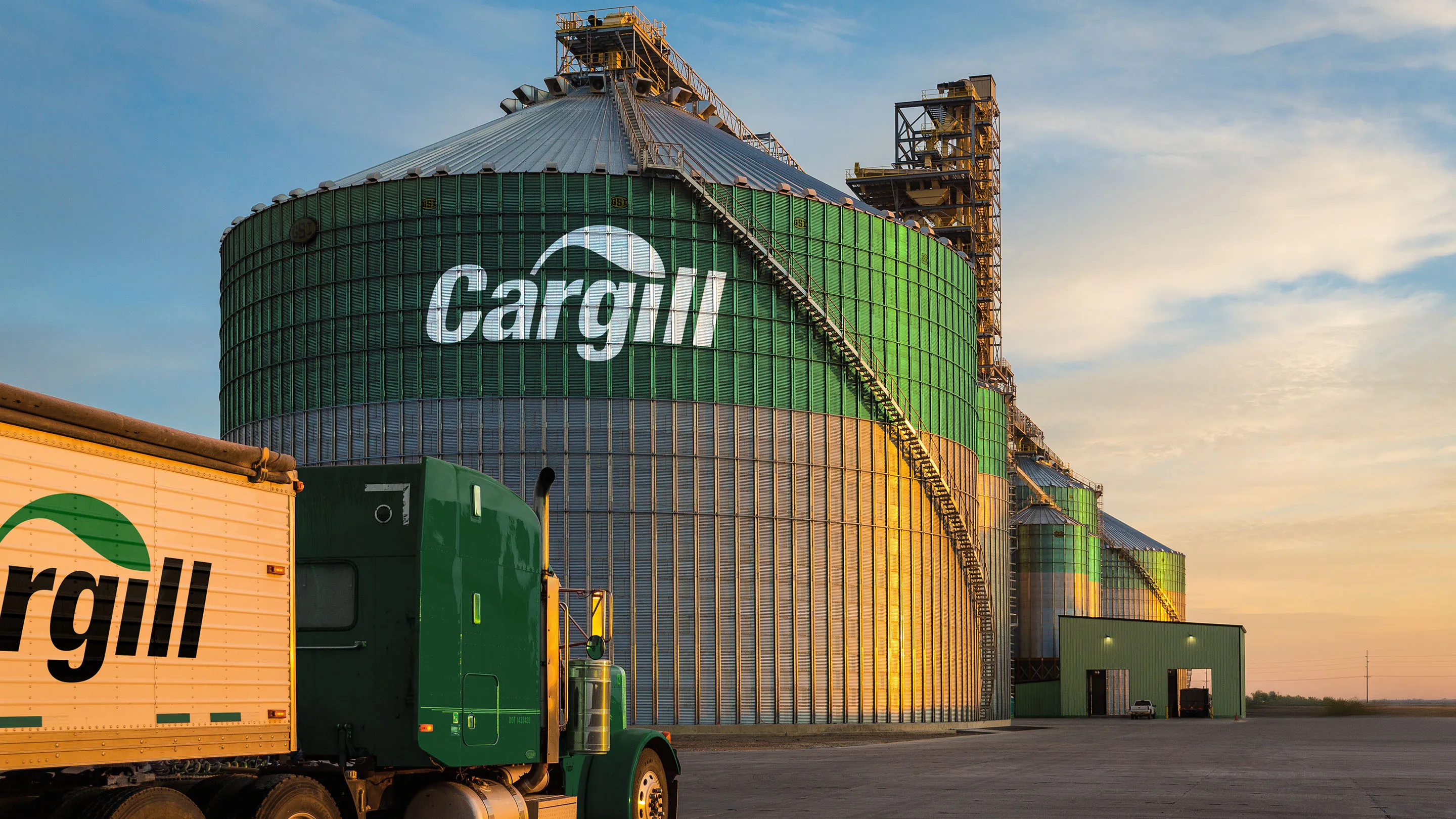
The Cargill logo had long incorporated a leaf symbol. As a symbol of growth, vitality and momentum we wanted to amplify this to date underused asset, elevating it from being only in the logo to being a critical and ownable equity, forming part of the overall design system, and communicating the idea at the heart of the brand.
Whilst we were aware that the category was dominated by the colour green we felt that Cargill, as one of the originals in it’s world, should be able to reclaim and ‘own’ green, which as part of its logo had been the company colour for many years but had recently become lost in a rainbow of colours used across the organisation. A refined colour palette was created, simplifying it to one dominated by green with just enough secondary colours to help them communicate their multiple propositions.
We reviewed their approach to typography and recommended they flip their primary and secondary typefaces using the new headline typeface to imbue the identity with a more classic, established tone, celebrating and reflecting the company’s 160 years in business. In turn the secondary typeface was clean and clear digitally and in print.
The visual architecture was revised, creating a stronger family feel across the organisation whilst allowing individual business units the flex they needed to shine.
We established a single icon style, recoloured illustrations, and provided photography principles that captured an ownable style for Cargill.
The Result
We created a distinctive, ownable and flexible design system which leveraged and modernised the key graphic while retaining as much of the existing system as was appropriate.
In short, through small changes, we achieved big impact.
Launched in October 2024, Cargill now has an identity that is recognisably Cargill, that unifies its multiple entities, liberates and amplifies its distinctive assets thus building equity back into the brand and importantly reflects its strength in its category and its business ambition.


