Brand Strategy and Identity: Taking aging out of the shadows.
The innovative Oak Street Health model puts older people at the center of care and culture. We worked with this team to create a brand strategy and identity that sets the organization up for its next chapter, by connecting it more closely with its audiences and purpose.
Where older adults are cared for, completely.
The change
It’s no secret that individuals 65+ in the U.S. don’t receive the same standard of care as others do, but Oak Street Health is on a mission to change that and rebuild healthcare as it should be.
For over a decade, Oak Street Health has improved life for older adults at their community care centers. Through deep community engagement, they are striving to make care more affordable, equitable and personal to older adults. During this time, the bold startup has grown, expanding to become a national force with over 130 locations around the country.
The opportunity
Driven by the key strategic insight that much of the conversation around aging relegates older individuals to the sidelines, Coley Porter Bell and Ogilvy positioned the brand as a place that embraces and fully values the wisdom and experience of older adults.
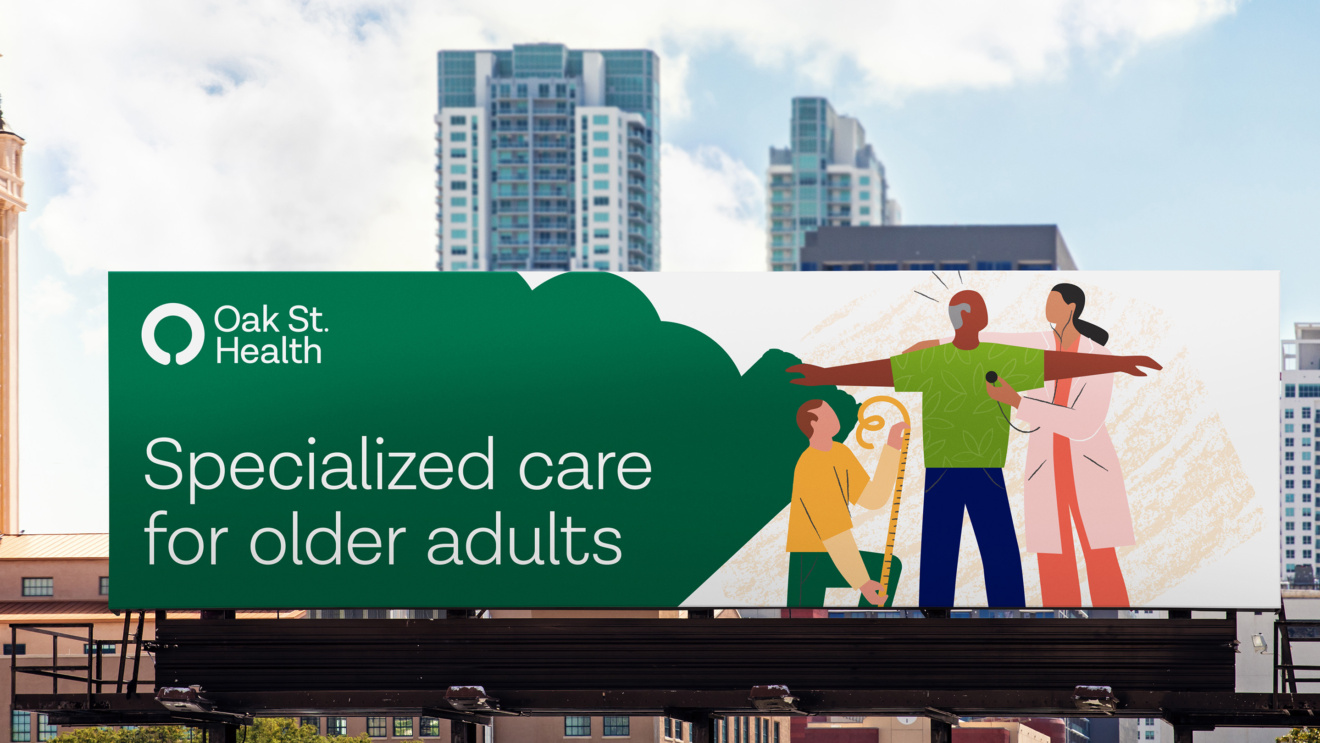
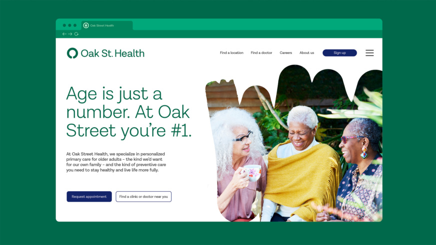
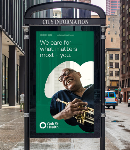
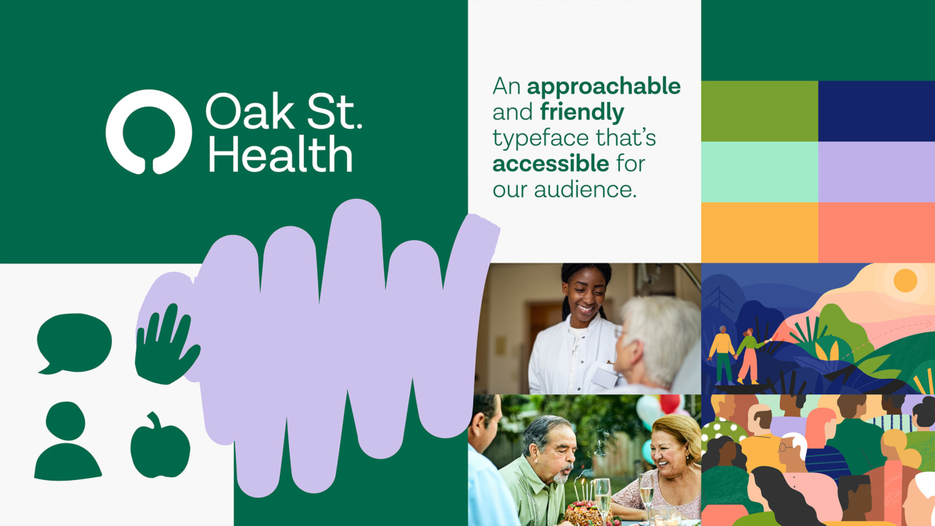
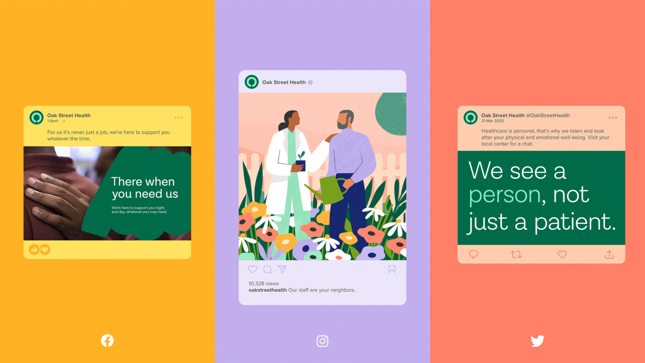
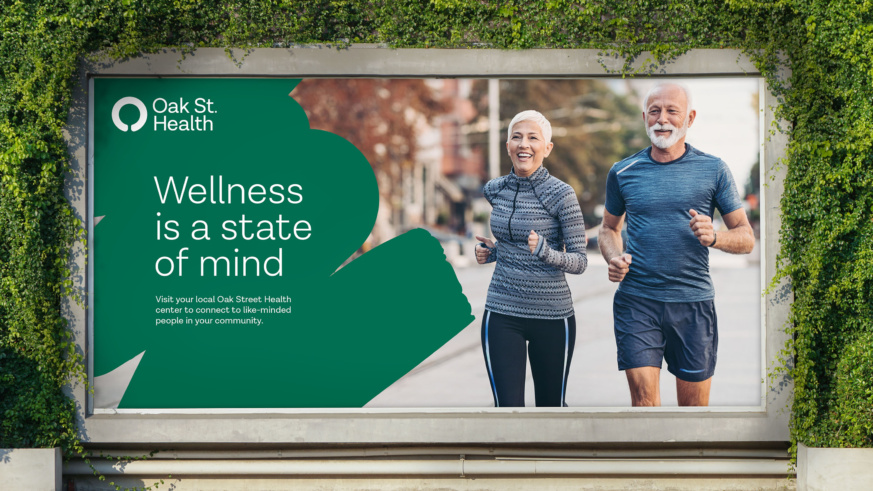
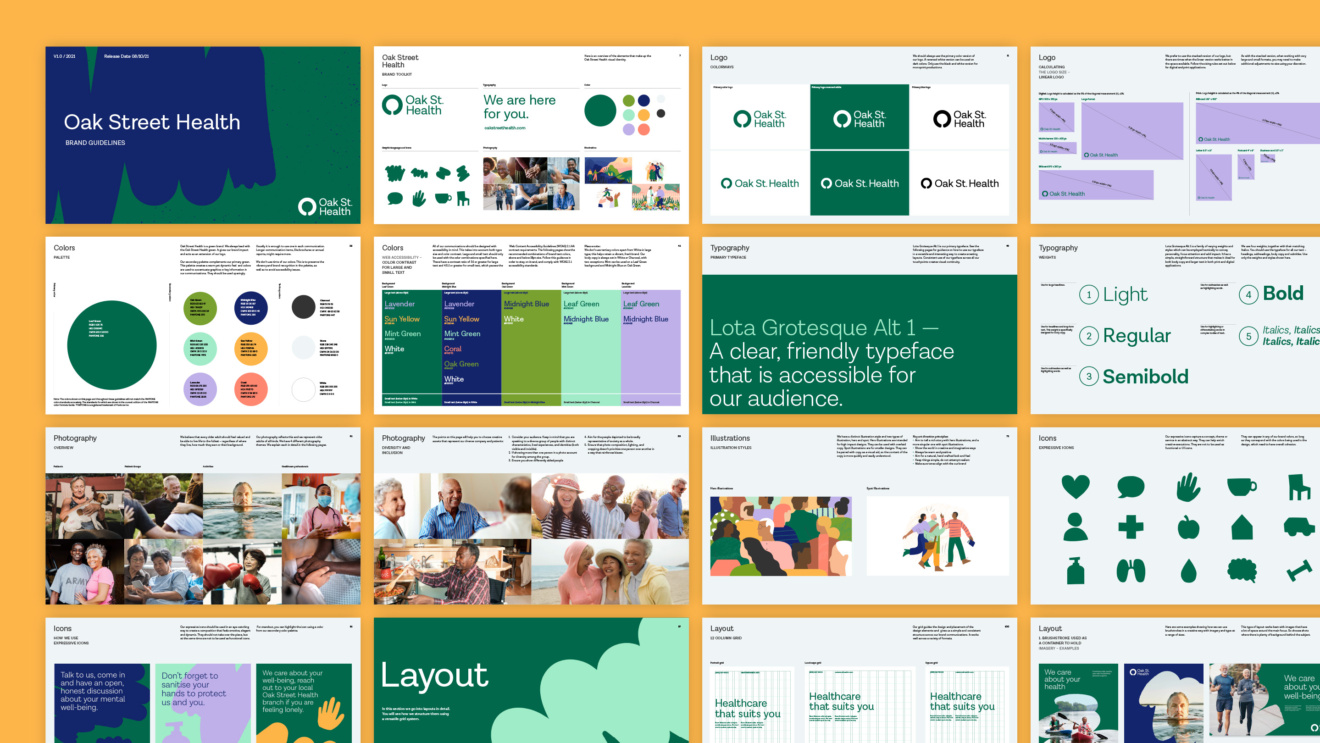
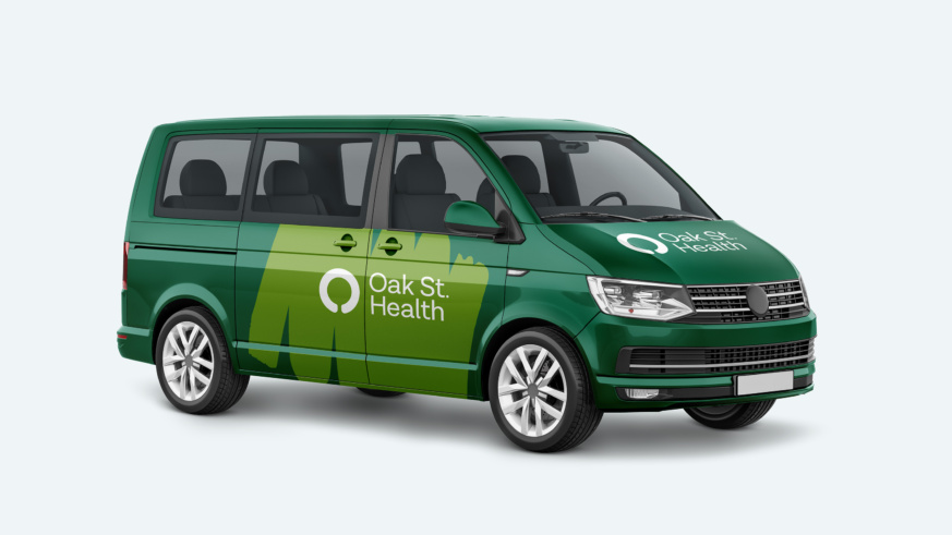
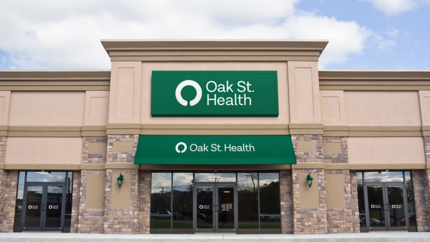
We brought this solution to life visually with an accessible identity designed around the needs of older adults, built to celebrate the Oak Street Health purpose.
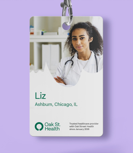
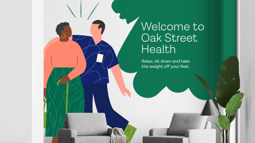
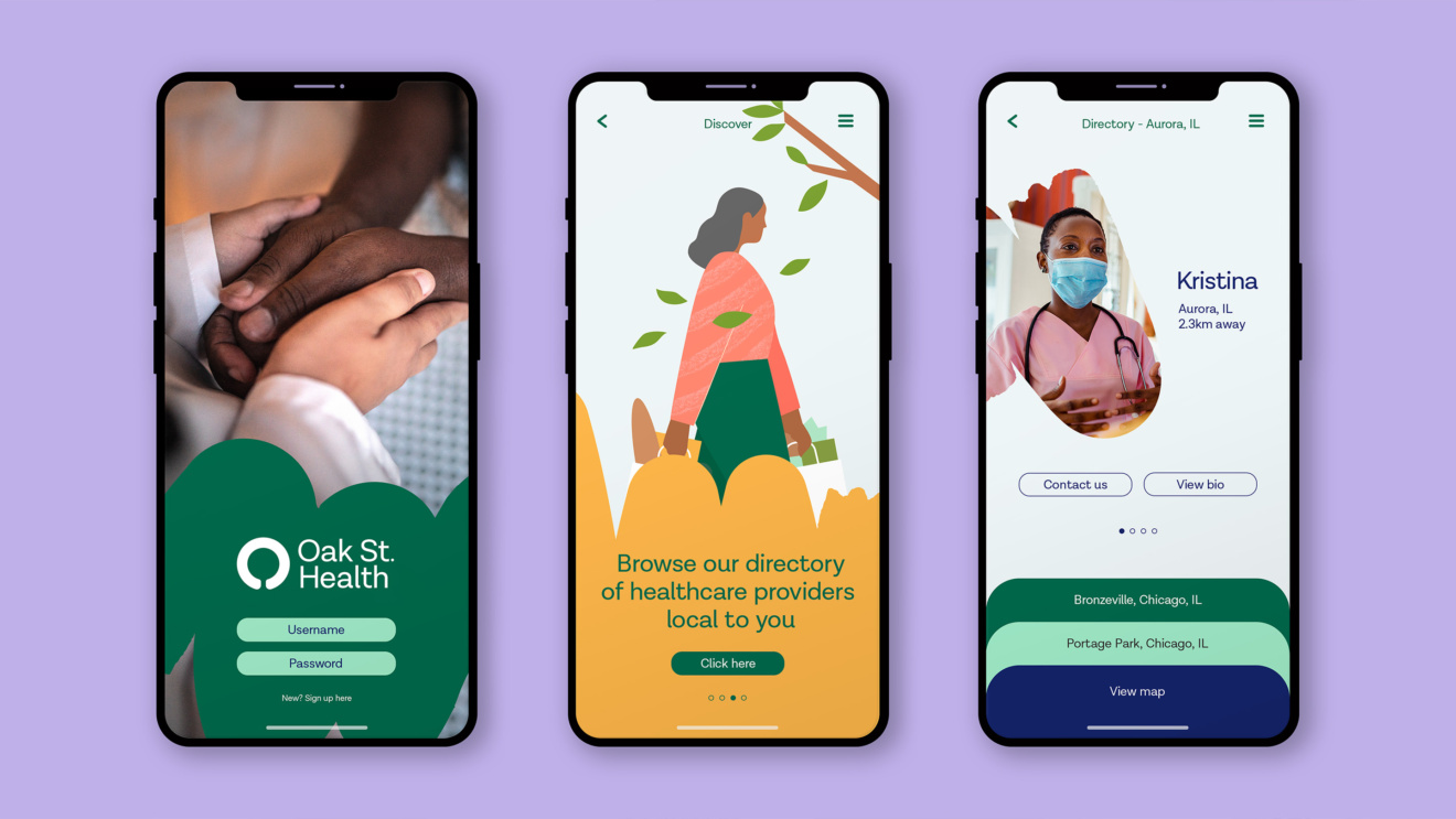
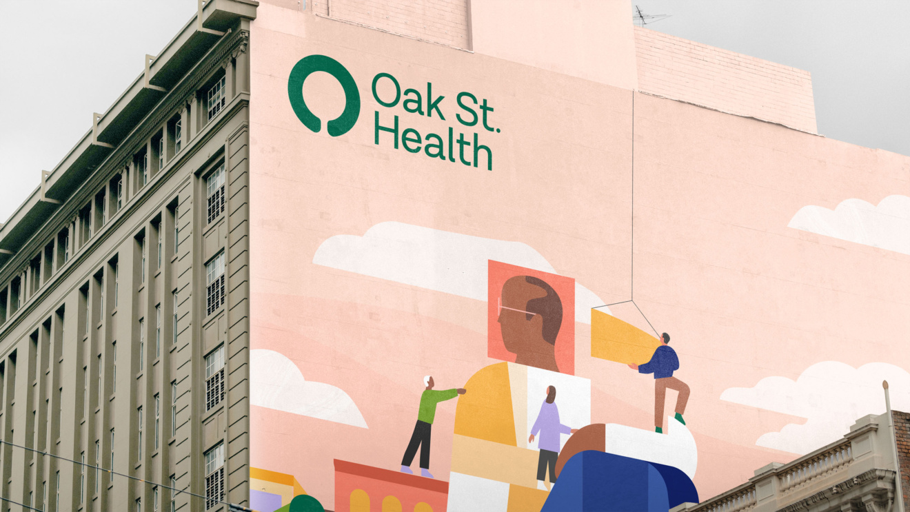
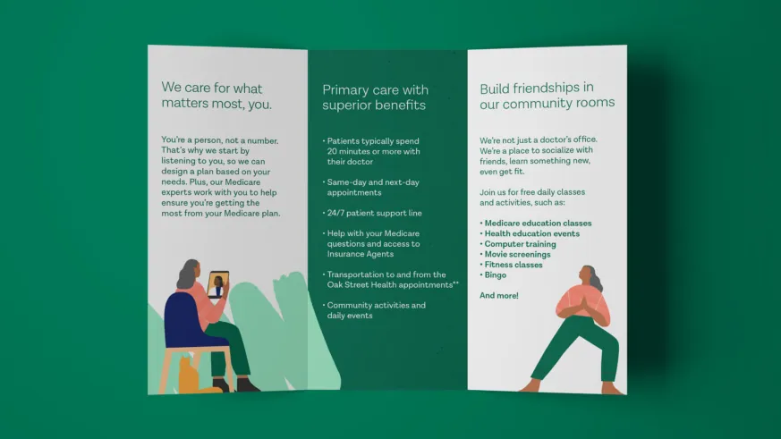
The new logo connects the metaphor of the mighty Oak with human-centered care, while warm colors and sans-serif fonts enhance readability and modernity. New photography and proprietary illustrations highlight genuine moments of care and interaction between Oak Street Health and its patients. The design system features a hand-crafted feeling, reinforcing that Oak Street Health is a brand built on love and care, by and for real people.
The result is full of humanity and expresses the human care that Oak Street Health brings to every interaction. The brand strategy and brand identity system have set the organization up for their new partnership with AARP, which enables the brand to reach and help many more people in need.
The result
Oak Street Health’s new brand is currently being implemented in over 170 locations across the US. Since its launch, the company has seen a significant increase in revenue, with a 51% jump from $1.43 billion to $2.16 billion. Within this time, Oak Street Health has also been acquired by CVS.
