Drawing from a proud history.
Jammie Dodgers’ reputation as a much-loved British biscuit-tin staple precedes itself.
With over six decades of shelf presence and lots of product variants in the mix, the No.1 jam filled biscuit in the UK needed to regain visual coherence to stretch into the future whilst building on its glorious past.
Going from good to great.
Born in the 60s, Jammie Dodgers are a popular British sandwich biscuit, owned by Fox’s Burton’s Companies. Baked from shortcake with a raspberry jam filling and named after the forever young and playful Roger the Dodger character from The Beano comic, the brand is de facto a childhood favourite enjoyed by families from generation to generation.
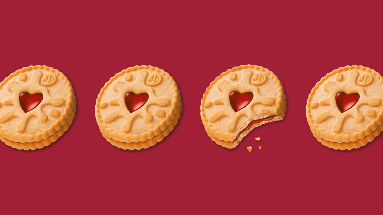
With strongly distinctive visual attributes (sticky jam heart, generous jam splat and ‘splodges’, playful bubble writing, red colouring), Jammie Dodgers was recognised and loved by consumers, making it the No.1 jam filled biscuit and the No.1 Kids biscuit in the UK market.
However, with multiple product variants launched over time, Jammie’s pack identity cohesiveness started to suffer. To support future growth Jammie Dodgers needed to achieve better portfolio consistency whilst ensuring greater differentiation of flavours and format extensions, to enhance variant awareness and support product innovations too.
The Opportunity
We decided to turn positive nostalgia into excitement by distilling the most unique emotional and functional aspects of Jammie Dodgers, into an ownable brand idea able to drive on-pack as well as off-pack brand expression.
The Unordinary Idea
‘Cheeky at heart’ encapsulates the qualities that make Jammie, Jammie Dodgers.
An idea that balances a good-natured yet mischievous brand attitude – one that deep-down is loved for its playful intention to test boundaries; with the most iconic visual feature of the product: the love heart.
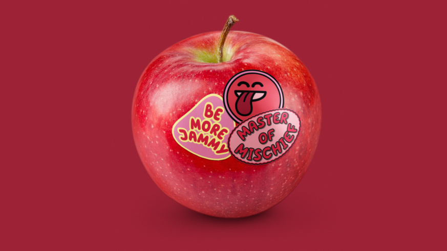
We brought ‘cheeky at heart’ to life by leaning into the visual language of children’s stickers to represent the cheeky, playful and sticky nature of the product.
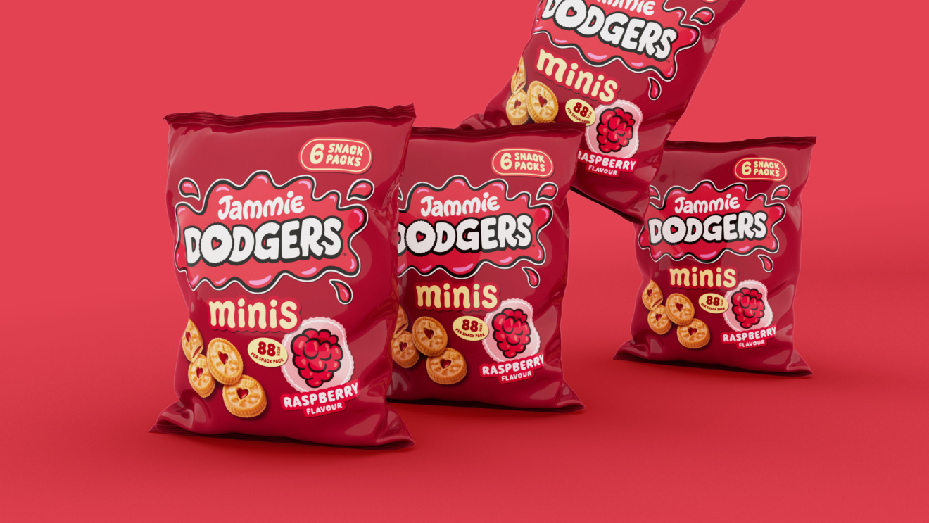
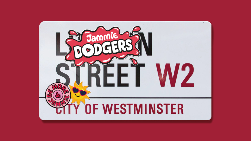
The brandmark, illustrations and typography were all updated to look as if they had been stuck directly onto the pack, with deliberate overlaps and slight angling of messaging to create a hand applied feel.
With the help of hand lettering artist Alison Carmichael, we took the classic Jammie Dodgers brandmark and evolved it to feel cleaner and more modern while retaining key assets like the heart in the ‘O’ and the playful jaunty angles of the bubbly typography.
We also changed the ‘splat’ that sits around the wordmark to be more visible and more clearly a lively splodge of jam. The brandmark is now always the Jammie Dodgers red colour to build more brand consistency.
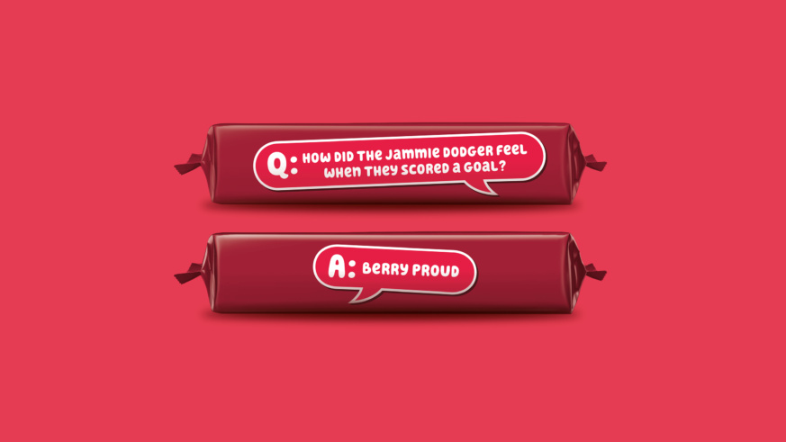
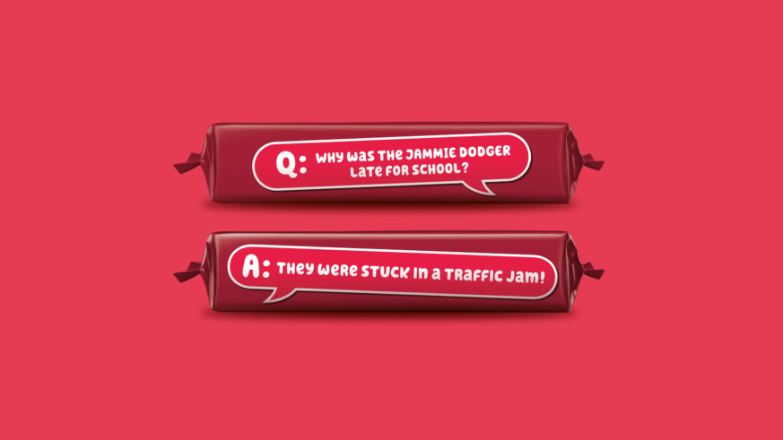
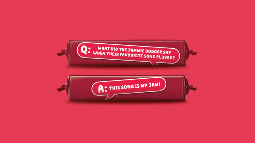
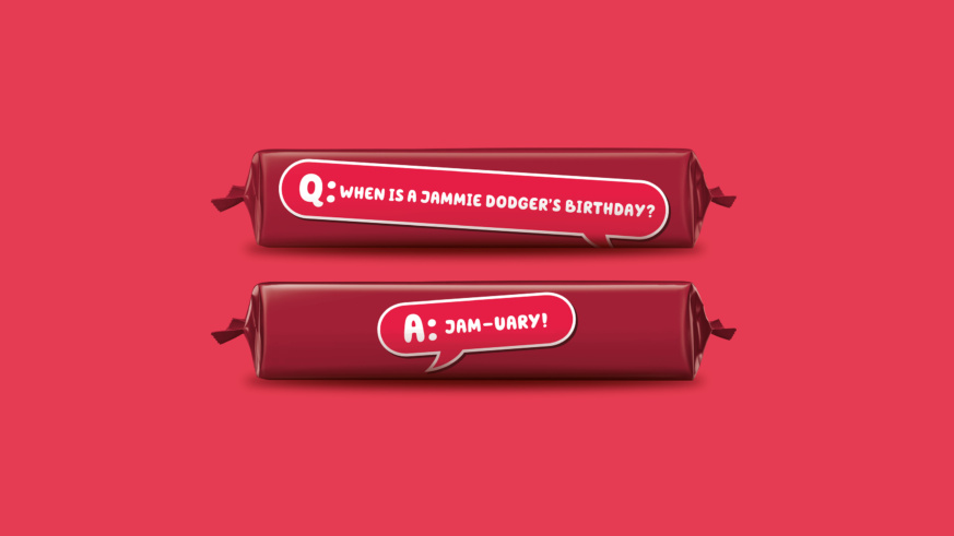
To aid navigation and showcase the different fruity flavours within the Jammie Dodgers range, we drew vibrant, fruity stickers in a style designed to appeal to the target consumer, and applied these with fun typography and cheeky claims to leverage the light-hearted-brand language, whilst reassuring adults who buy the brand.
Launching it across over 10 SKUs including classic and Minis formats, the new brand identity is a celebration of taste and cheerfulness anchored to a reassuringly warm feeling of trust and familiarity.
The Launch
The new Jammie Dodgers brand identity has hit UK shelves from late summer 2024 and will be supported with an above the line campaign and the brand’s first TVC in over 5 years.
