What do dogs and estate agents have in common?
The property category has been heavily impacted by technology over recent years, which has altered consumer behavior by making searches quicker and easier.
What hasn’t changed is the category’s stilted creative approach. One crucial consumer touchpoint is the simple ‘for sale’ sign. It’s the most visible manifestation of the brand for many estate agents, with an enviable opportunity to advertise themselves in prominent places around homes.
But most signs are simply a brand name on a board. This raises awareness – which may or may not be needed by the brand – but communicates very little else. It’s an opportunity missed.
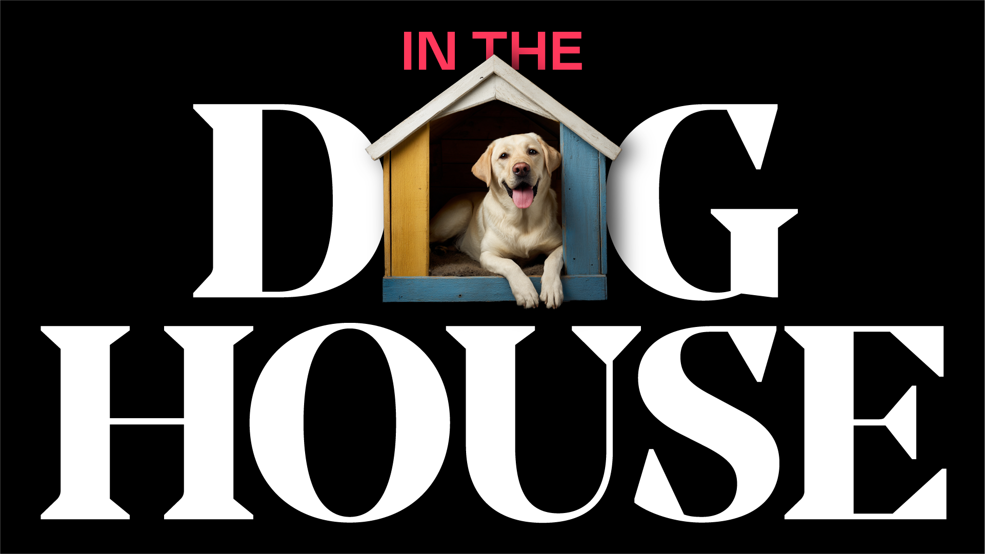
Which takes us to the dogs. Wards estate agents have broken from the pack, with their sale boards featuring full bleed images of joyous, fun, thrilled dogs. This simple Unordinary Idea is original, eye-catching and memorable.
Additionally, dogs are fantastic at emotion, effortlessly conveying the giddy excitement of having a new home. They’re loyal and great at service. So rather than saying something boring like they’d be your ‘trusted partner’, the brand has accrued these positive attributes with a touch of creative inspiration. Turns out dogs and estate agents have more in common than you’d think.
I came across something I thought we might use as an Unordinary Idea for socials (or at least as a starting point!). Rare Beauty is taking an interesting approach to packaging design that stands out in the beauty industry.
Through their Made Accessible Initiative, they worked with the Casa Colina Research Institute to test how easy their products are to use for people with limited mobility in their hands and arms. This led to simple but powerful changes, like matte finishes for better grip, rounded shapes, easy-open caps and applicators that do not need much pressure. Importantly, they have committed to sharing what they have learned so that other brands can follow.
They have also just launched (2025) their first fragrance, and they carried this thinking into the design of the bottle. With input from hand therapists and packaging engineers, they created an oversized pump that can be pressed with a palm, multiple fingers, or even the forearm, making it much easier for people with dexterity or mobility challenges to use.
In an industry where packaging often puts looks before function, Rare Beauty has managed to combine thoughtful design with inclusivity. It is a great reminder that accessibility can be both innovative and brand-defining

