
Written by: Jenn Szekely, President US
Rebranding is the hardest job in marketing – if the back and forth around Cracker Barrel’s new identity is anything to go by. Coley Porter Bell’s Jenn Szekely masterfully lays out what went wrong.
Nationwide uproar, a falling share price and disapproval from the president himself. There are a lot of things that can go wrong when rebranding, and Cracker Barrel hit a home run in the past week.
The multitude of opinions about the Cracker Barrel saga is one of the many reasons I love branding.
Branding unites people; it gives us iconic visuals and personalities that become a constant, familiar presence in our lives. And we feel the loss of their presence when a company unsuccessfully rebrands.
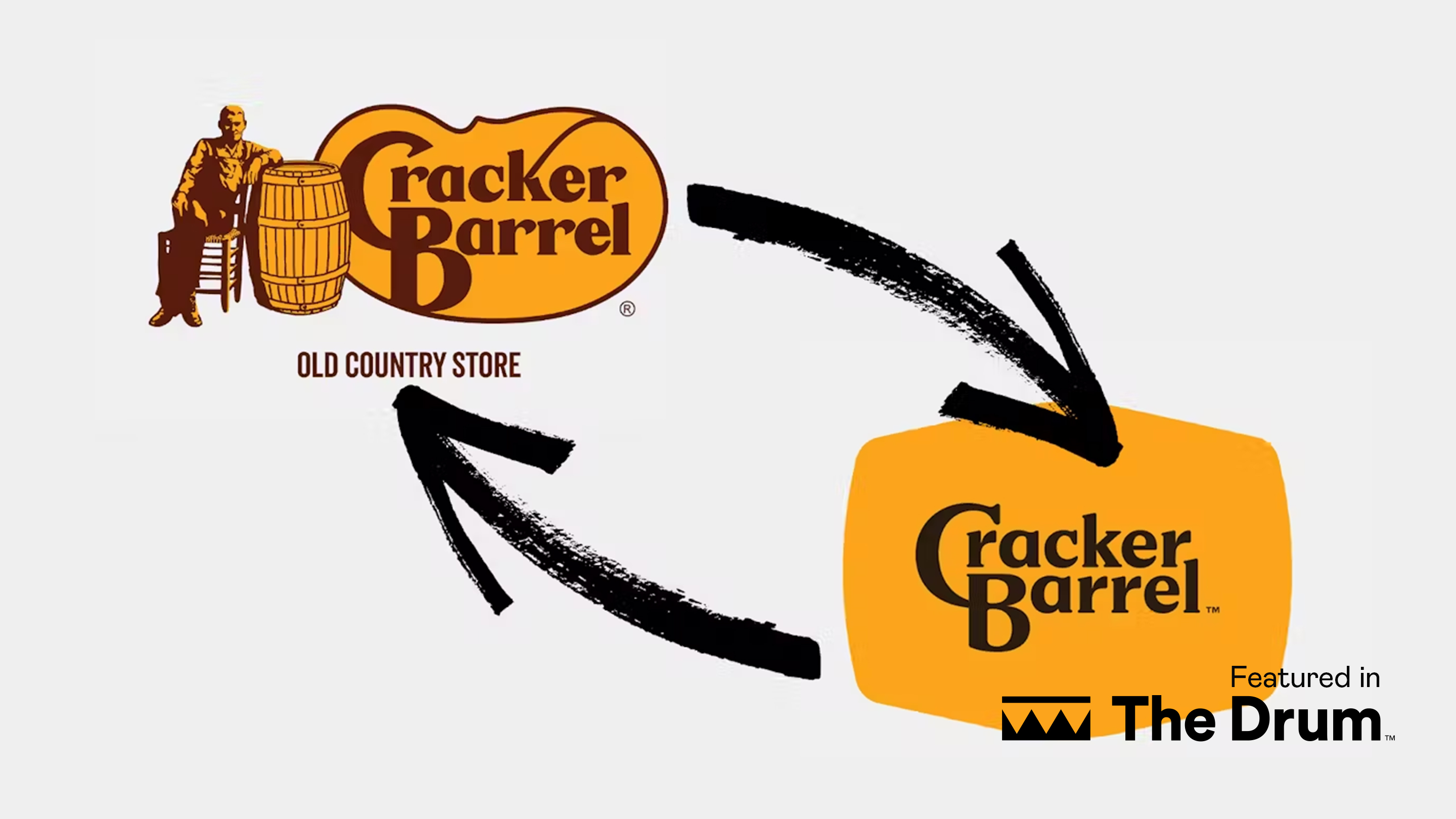
In the case of Cracker Barrel, its logo hasn’t generated much discussion or debate over the past 50 years. That is, until last week.
The backlash tells us how much of an iconic heritage brand it is, and its logo has played a significant part in the company reaching its icon status. But the polish of the new brand lost all of this heritage. It stripped away the personality of the brand, eroding something it has uniquely retained over the past few decades.
By trading its distinct mom-and-pop shop feel, Cracker Barrel introduced something that was too clean, even and manufactured. The brand oversimplified it, walking away from its heritage.
Read the full article here to learn more.

