
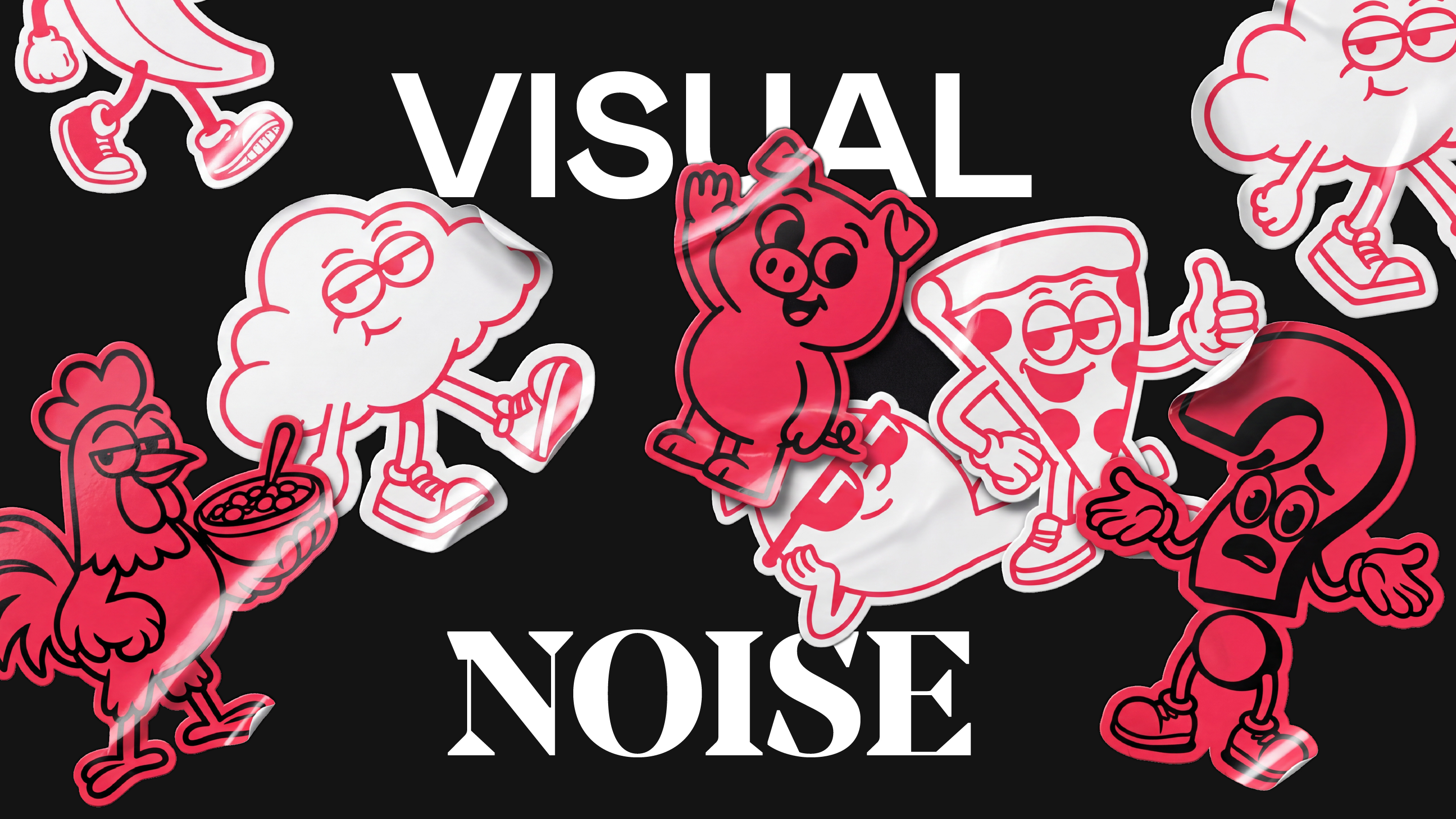

The UK FMCG market is undergoing a major personality shift. Goodbye minimal, sterile layouts; hello to bold typography, delicious photography, and illustrated characters. This feels remarkably welcome, as if packaging is reaching off the shelf to strike up a warm, honest conversation. But as this trend goes mainstream, we must ask: are we using characters for genuine strategic storytelling, or just for character’s sake? At the heart of any great mascot, there has to be a brilliant, unordinary idea. Take Marks & Spencer’s Percy Pig, a beloved character built on decades of emotional storytelling and brand equity, keeping the retailer’s association with premium quality intact. Without that authentic connection to the product’s narrative, playful packaging illustrations are merely aesthetic shortcuts. They risk dissolving into visual noise rather than anchoring a larger brand truth. We see this strategic intentionality in the revitalisation of Kellogg’s Cornelius the Rooster. By transforming Cornelius into a glorious, vibrant morning ambassador, they elevated him from a static box illustration into a living catalyst for breakfast joy. The execution succeeded because the redesign was built around a meaningful brand idea, deeply rooted in everyday morning rituals rather than fleeting trends. When the core idea, character design, and brand strategy work in perfect harmony under a rigorous design brief, we find creative magic. It transcends mere playfulness and builds a lasting emotional bond. That is the kind of thoughtful, conceptual design that proud consumers are always genuinely excited to put into their own shopping baskets every single day.

