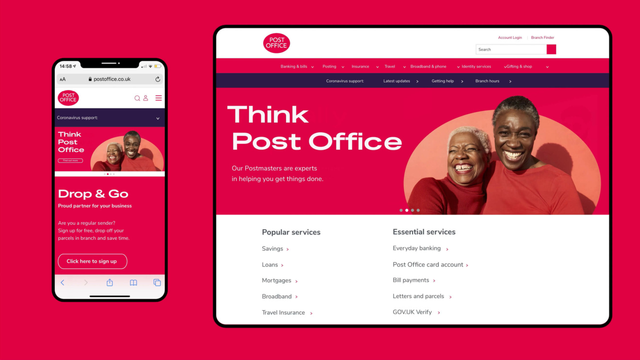
Taking the Post Office from forgotten to local hero.
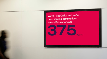
Despite 375 years’ service, Post Office had lost its emotional connection with Britons and was fading into the background. We gave the brand a bold new identity that celebrates this beating heart of local communities. An identity to make us fall in love with this British icon again, and give it the recognition it deserves.
From wallflower to local hero.
The Change
For over 375 years, Post Office has been at the heart of the UK’s local communities all over the country, providing a wide range of postal, banking, travel and other essential services.
But changes in retail, communications, and technology had steadily eroded the brand’s position in people’s lives. Whilse the Post Office still offered an array of relevant services, it needed to reconnect with its audiences.
The Opportunity
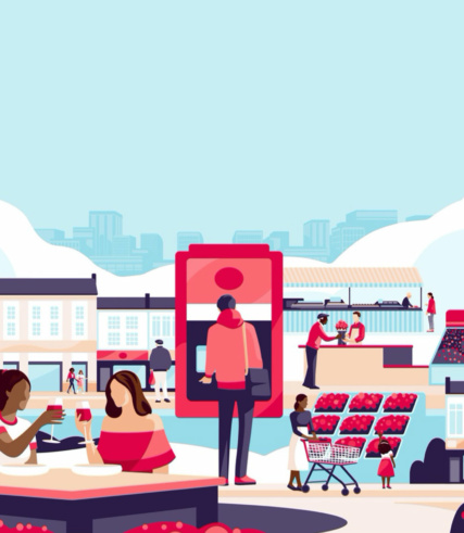
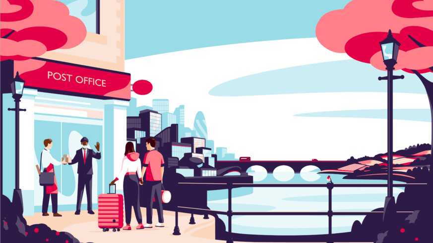
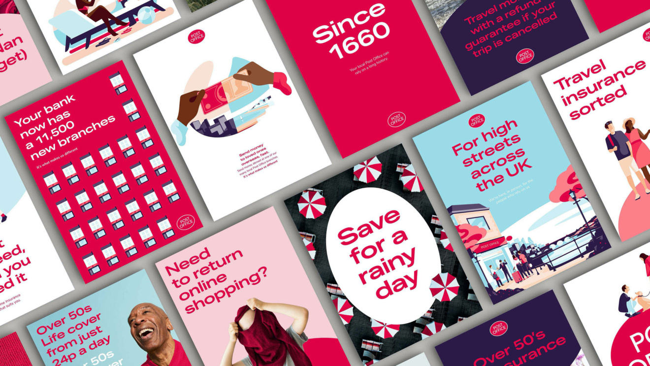
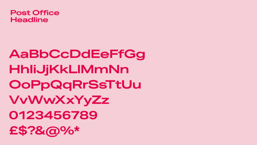
We created a brand strategy and brand essence, ‘it’s what makes us different’, which led us to a bold new visual identity which celebrates modern Britain and casts Post Office as the local hero it’s always been. A role rediscovered during the pandemic, when branches remained open, providing vital services and reminding Britons of what this iconic brand can offer both functionally and emotionally at the very heart of their communities. The design system amplifies the oval logo shape, elevating it to a distinctive asset, baking the shape into the new typeface, the bold illustration style and the overall design system.
The Result
Post Office now has a brand deserving of who they are: a unique British institution, striving to help everyone who needs them.
“A huge thank you to all involved, I know it’s been a monumental effort to get to this stage. They look great! The guidelines are key in addressing some of our biggest brand challenges and provide us with plenty of opportunity to meet our strategic priorities towards 2025. They signal change, and this is paramount right now. Feeling very proud of what we have achieved, together.”
Head of Brand
