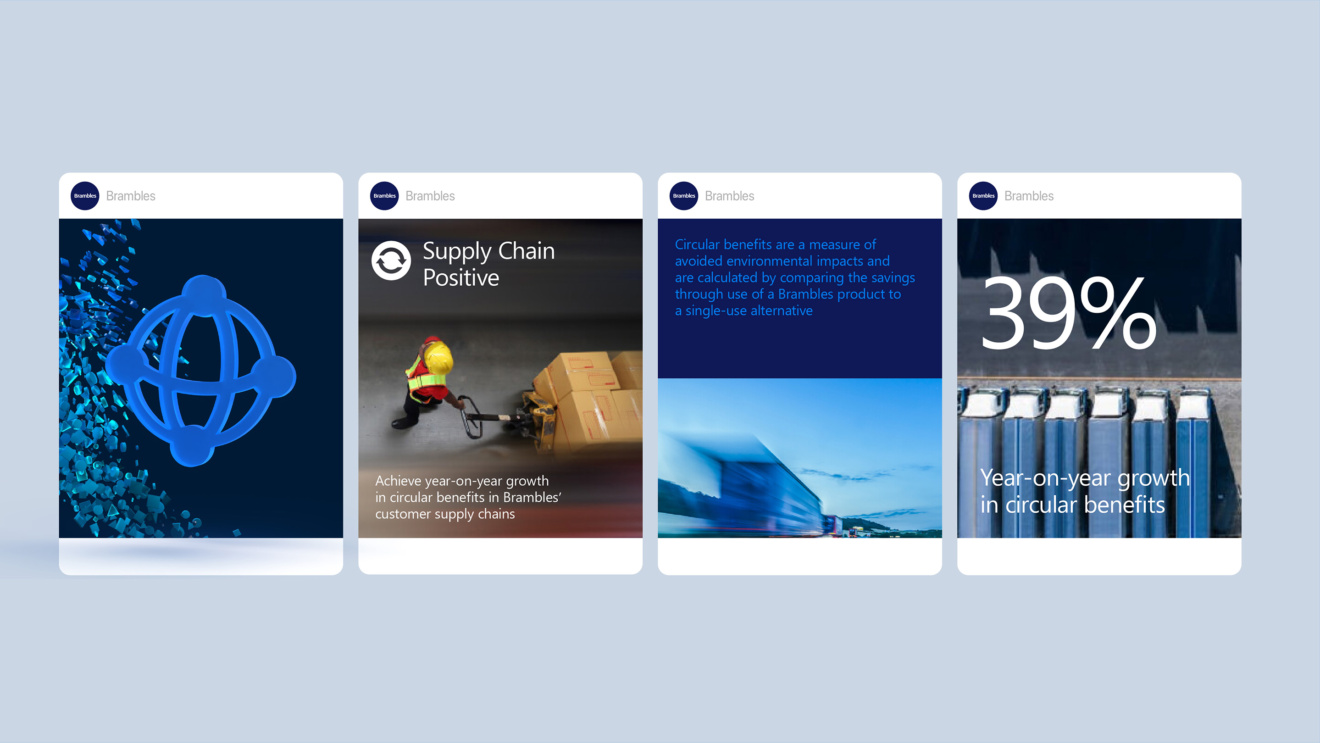
Branding a sustainable regeneration system
Brambles and CHEP are leaders in the global logistics category. Both brands have a strong sustainability record and ambitious programme – but this was not being communicated by either.
The Change
In recent years Brambles has decided to move beyond conventionally sustainability, to making its supply networks actively regenerative, adding more in than it takes out.
This presented a branding challenge. How could they convey their inherent dynamism and interactivity? Current visuals were worthy but disconnected, presenting the strategy in a static way that didn’t tell the brand’s story. The brand’s three sustainability pillars—Nature, Business, Communities—were treated as separate tracks, hindering understanding of CHEP’s integrated operations.
The Opportunity
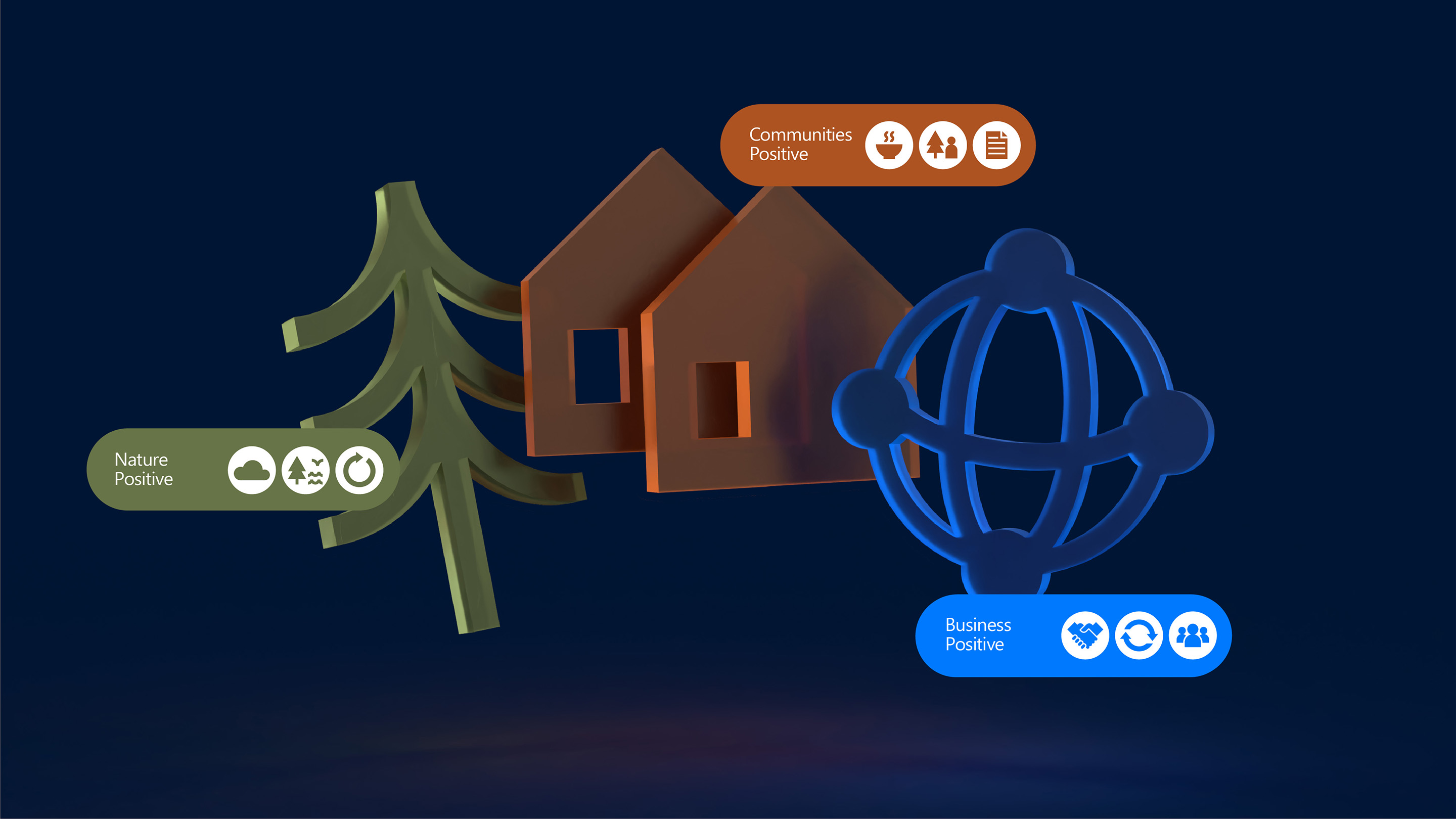
The solution was to develop a dynamic new regeneration system graphic. This began with an animated system map. Nature, Business, and Communities became living nodes, interconnected by flowing paths representing material flows, carbon, and community impacts.
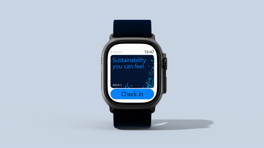
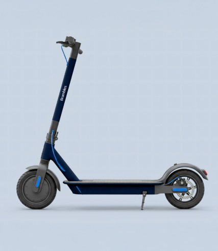
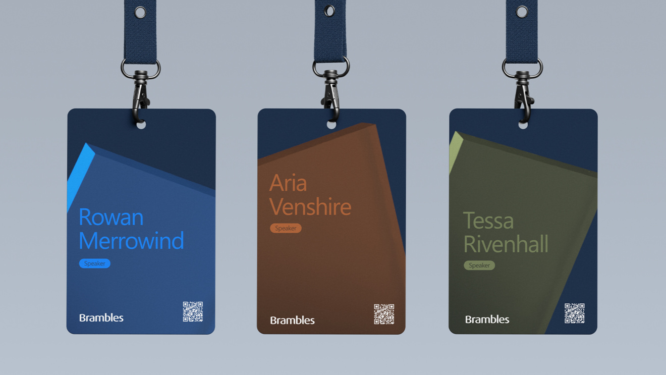
The primary icons for each were created using the brand’s graphic style. An original secondary icon suite was developed for the specific programs. Motion curves and micro-interactions transformed data into living, evocative signals. This versatile toolkit ensured a coherent narrative across all channels, from dashboards to customer certificates.
The Result
The new regeneration system transformed how Brambles’ sustainability work is communicated, making its abstract goals more tangible for its audience.
The regeneration system graphic has fostered a crucial human response: partners understand their role, employees feel part of a regenerative arc, and customers intuitively grasp circular models. Brambles’ sustainability story now stands out as a living, dynamic expression of its ambition, inviting everyone to see, feel, and build the future

