Brand refresh to help Boots reconnect with its brand purpose.
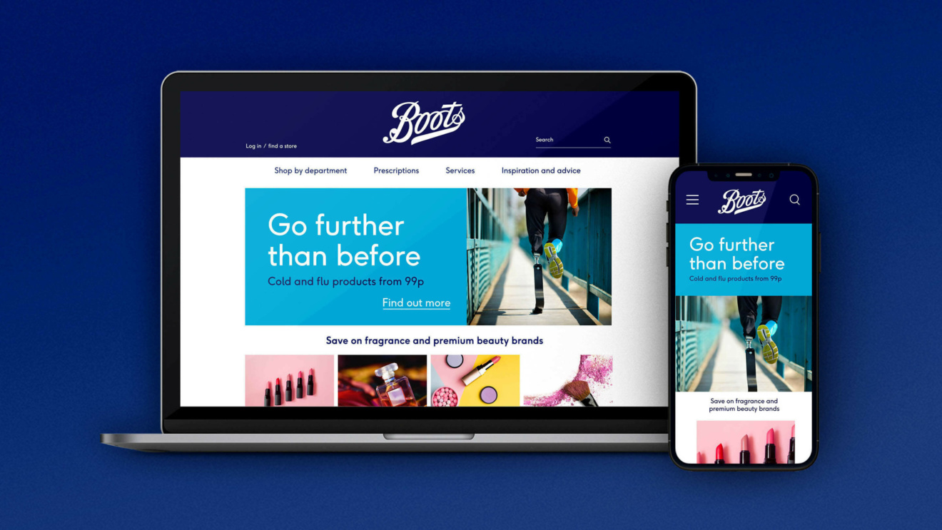
When Boots was falling behind against new competitors in the beauty and wellness categories, we helped the brand reconnect with a purpose that had been buried – yet was now more relevant than ever. The result is a powerful new brand identity that resonates strongly with consumers and is truly fit for the digital age.
Nursing the nation’s favourite healthcare brand back to health.
The Change
Boots is one of Britain’s best loved brands. But 170 years on, it was starting to struggle. People’s ideas about wellness and their relationship with wellness brands had changed completely. New competitors – from discounters to online beauty specialists – were shaking up every category Boots operated in. And what’s more, its identity hadn’t been reviewed in decades and was out of step with what modern marketing needs.
The Opportunity
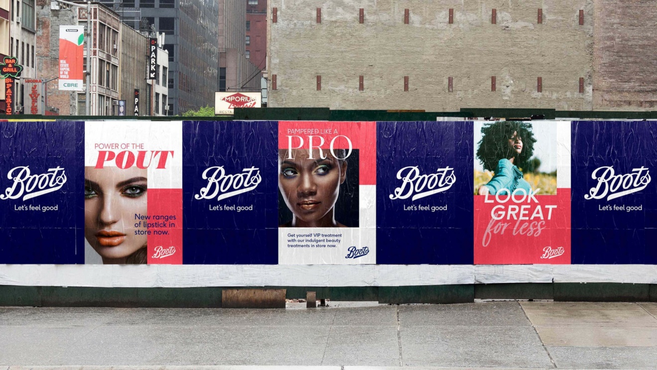
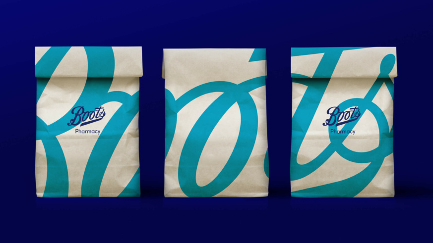
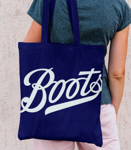
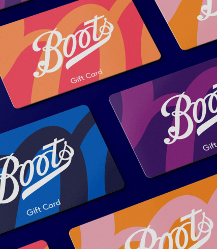
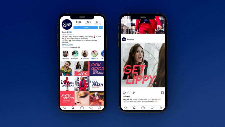
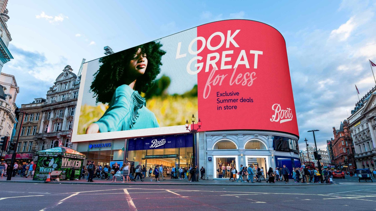
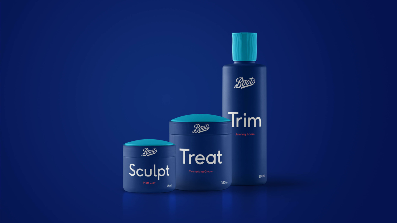
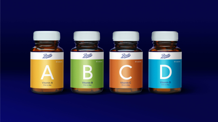
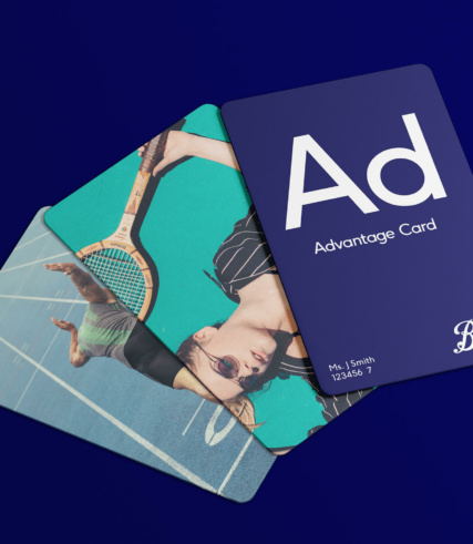
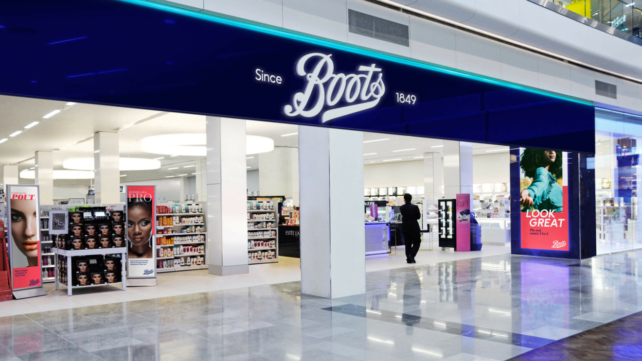
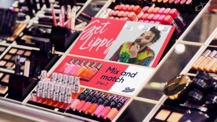
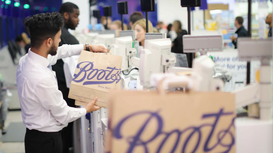
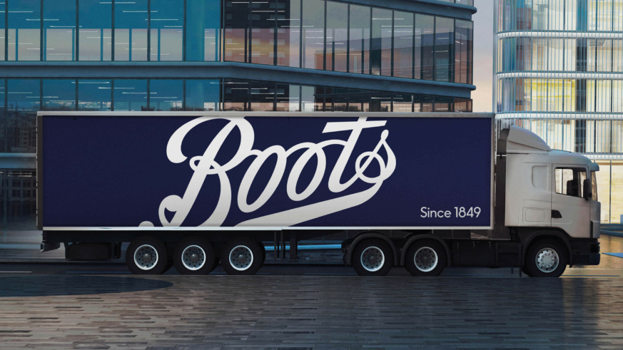
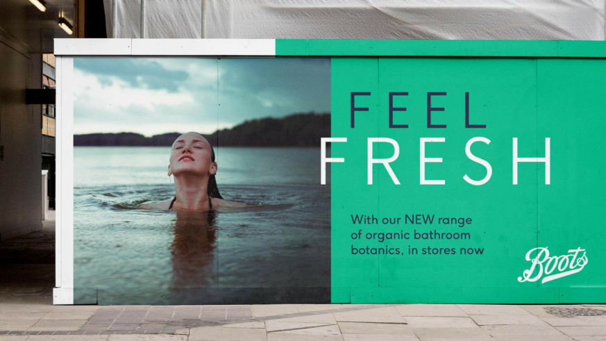
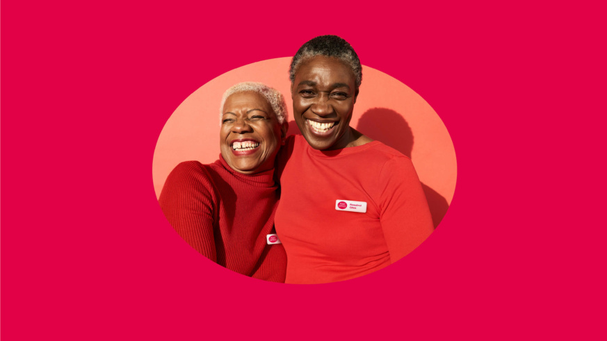
We reviewed every element of the Boots brand strategy and found at its heart a brand purpose that still rang true but had never been activated: Our confidence inspires yours. From this simple but powerful idea we freed the familiar logo from its dated lozenge, and designed a new and emotionally engaging brand identity for the digital age – flexible enough to shine in the very different arenas of beauty, wellness and pharmacy. We went on to work alongside Ogilvy as brand guardians as they brought the new identity to life through TVC, OLV and social media.
The Results
Since the new identity launched in Covent Garden’s Boots Store of the Future, satisfaction has improved (especially amongst the crucial under 40s), and significantly more customers view the brand as ‘modern and up to date’. In some categories the new store also beat sales targets by up to 14%.
The Awards
- Best Visual Identity in the Retail Sector (Silver) – Transform Europe Awards
- Best Use of Typography (Bronze) – Transform Europe Awards
