
Here’s a short interview with our Creative Director who worked across the Boots rebrand, on how and why the end design was chosen.
What were the challenges in evolving such a well-established brand?
With a presence on nearly every high street in Britain, and a brand as trusted as Boots, the implications around changing a brand that is much loved by the British public are enormous.
Whilst the objective of the business to feel more modern and more relevant were quite clear, that desire had to be perfectly balanced against the risk of alienating a very loyal existing customer base.
How important was audience recognition to the re-brand?
The need to balance the rich heritage of boots with a more modern, fit for digital look and feel was absolutely vital.
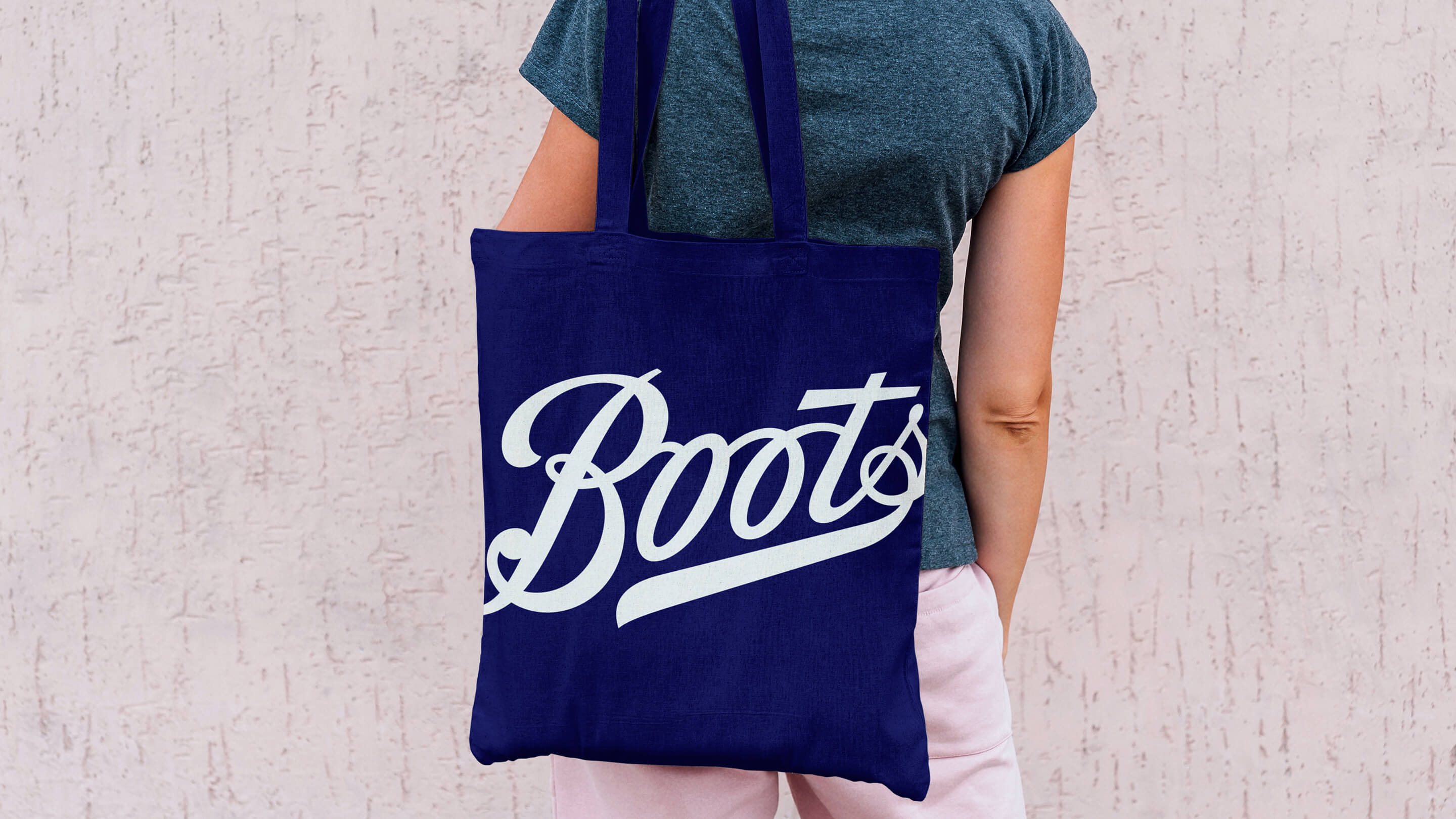
Boots hadn’t been through a rebranding process for some time, so naturally there was some trepidation when we first started talking about redrawing their iconic logotype. After all, it hadn’t changed in nearly 170 years.
As a brand, Boots is broad; it appeals to everyone from teenagers venturing into beauty and make up for the very first time, to repeat prescription customers, to those facing tough challenges to their health looking for expert opinion and advice. All those different customers need to feel comfortable and welcome.
I remember Seb’s words clearly: “we want our customers not to notice… we want to create a feeling… as though they notice something has changed, we feel a little more elegant, a bit more modern… but they can’t quite put their finger on it.”
How did you make sure stakeholders were engaged with the branding project?
There were many stakeholders involved across the business, but there was a universal recognition that the brand needed to evolve in line with the new business strategy. We ensured through regular client contact they were involved and engaged through every part of the process. Seb was very hands on during that process – and that helped enormously.
What was your favourite part of the process?
Working with professionals that are masters of their craft. We commissioned Rob Clark for the logotype development. He’s a master of digital sign-writing, so the perfect partner to work with as the Boots’ logotype was effectively a digitisation of the 150 year old original. We worked with Rick smith to customise the Boots typeface, and again his skill and expertise in type design is practically unparalleled today.
What are the big challenges facing brands today? How can they evolve and stay relevant in a world of digital disruption and fickle consumer tastes?
The high street is in peril. Many brands are too slow to respond to the changing nature of consumer behaviour. They need to pivot, and they need to do it now. Brands like HMV, a truly iconic brand, failed to see the threat of the digitisation of music. They needed to embrace it and make it theirs.
The film industry is facing a similar challenge. With Netflix topping 140 million subscribers and now a major generator of content, they are no longer just a distributer. TV channels and Broadcasters must be concerned – and must adapt.
Physical brands need to think about, and really dial up the experience and play on the expertise of their staff…something that is missing in the digital customer journey.
And finally, what’s your favourite part of the brand?
Really there is no one element, the new compositions we’ve created around a flexible grid structure work really well. New Insta-style photography feels at once more modern and contemporary, yet more authentic and real-life. Losing the original AG Buch rounded typeface family and replacing it with the Boots bespoke cut of F37 Ginger, has had an immediate visual impact.
But I guess losing the Boots blue lozenge, introduced back in the 50’s or 60’s was a really positive change. It was a hangover from the old days of branding when a device such as that was used like a stamp.
As a holding shape it literally held the brand back. Losing It enabled us to be much more dynamic with the brand. We are now free to use the logotype in a multitude of ways. We’ve introduced scaling, cropping and alternate colourways, and it works so much better in the digital space.

