
Rebrand the Flying Rat.
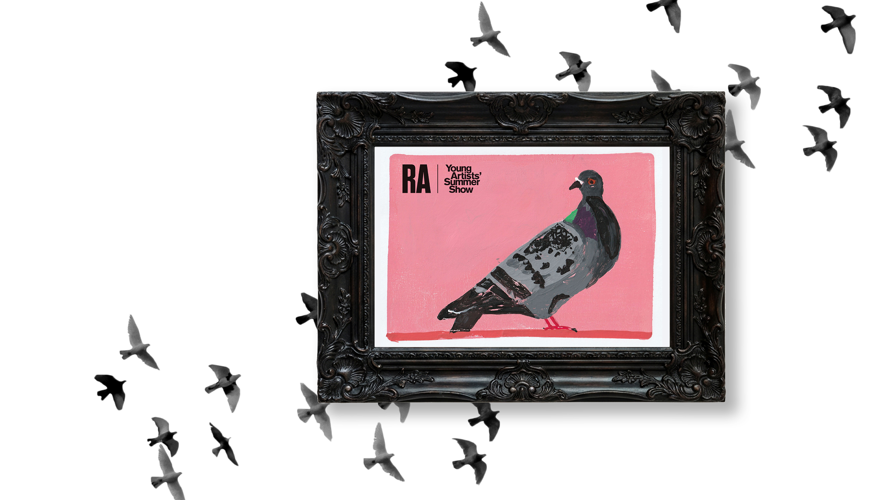
There was a striking entry in the recent Royal Academy Young Artists’ Show. Selected from 32,000 entries, the 11 year old artist ignored the usual choice of drawing a cute pet, and instead chose to hero the “feral” street bird, regarded by some as a flying rat. Creating a Gelli plate print of the humble pigeon against a candy-pink background, the artist has rebranded a common pest as a distinctive icon.
The lessons?
1. Reframe the ordinary: It takes courage to look at the mundane and find a new angle that makes it shine.
2. Embrace the ‘wobbly lines’: In an era of polished AI perfection, audiences crave the texture of human creativity.
Brands need to find their equivalent of that candy-pink background. It’s easy to default to the cute cats and dogs – or blue and beige for brands – the safe ideas we know people already like. But in branding, safe means invisible. Unordinary impact comes from the ‘pigeons.’

